The Corner
Brand Transformation
Working with creative agency The Corner, as part of their 10 year anniversary rebrand, we blended photography with typographic and CG craft to take their identity into a bold new place. Created for use across all platforms, the living logo represents the transformative nature of The Corner’s practice.
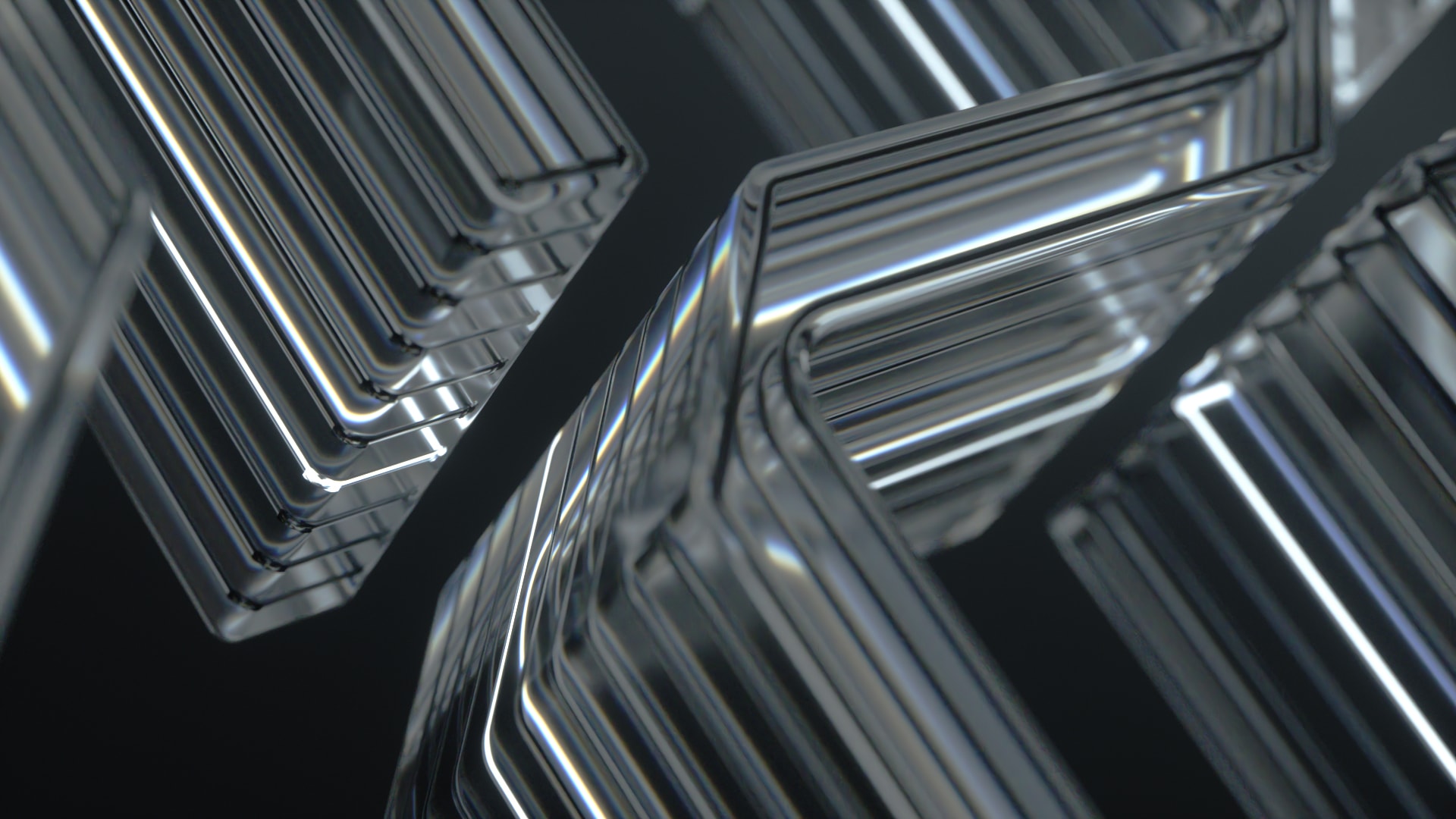
The hero prism orbits and multiplies, creating delicate forms through which to view The Corner’s logotype. Constantly moving towards the light, the elegant formations respond to everything they touch.
We realised the logo as a solid glass prism and tested its effect on light, graphic elements and typography. The Corner’s logotype is subjected to the effects of the infinite looping glass form, creating a simple, elegant result that treads a fine line between legibility and an optical representation of agency’s transformational practice.


Research for this project began in-camera, with our team exploring the unpredictable effects of multiple light sources on a prism. We learned a lot about surface detail and its effect on colour and clarity and then used this to push the idea of transformation. Once we established which materiality and form the prism would take, we referenced the effects of real-world glass in CG, extending the limits and capabilities of optical physics.


-
Credits
- Client The Corner

